Since June 2025, digital accessibility is no longer just the government’s concern. E-shops, banks and transport operators now have to address it too, or face significant fines. But how much does it actually cost? For the iROZHLAS app, auditing and updating five-year-old code took us one week and roughly 220 lines. Here’s why it was so cheap, and why that was no accident.
Until recently, digital accessibility, meaning how well an app can be used by someone who can’t see the screen, has impaired hearing or can’t hold a finger steady on the display, was mainly a concern for the state and public service institutions, because that’s who the law covered. Since 28 June 2025, that has changed: the law through which the Czech Republic implements the European Accessibility Act now applies to the private sector as well. Specifically to e-shops, banks, transport operators and e-book providers. New services must comply immediately; existing ones have until 28 June 2030. Non-compliance can lead to significant fines.
And this is no fringe group of users. According to the WHO, 1.3 billion people live with a significant disability. That’s 16% of the population, or one in six people. And that doesn’t even count the situational limitations most of us face every day: reading in direct sunlight, listening on a noisy subway, using an app with a child in one arm.
So the question for product owners is no longer “Should we deal with accessibility?” but “How much will it cost us?” Our answer from practice: if you haven’t neglected the basics, surprisingly little.
How We Made the iROZHLAS App Accessible
In version 6.1.0 of the iROZHLAS app, we completed a set of accessibility features and filled in the Accessibility Nutrition Labels on the App Store. The full audit and all changes to a codebase more than five years old took one week and ~220 lines of code. This article is the story of why it was so cheap (it wasn’t luck).
Before we dive in, let’s sum up why accessibility is worth your attention.
Six reasons accessibility belongs on your roadmap
- Regulation is no longer just for the public sector. Since 28 June 2025, the EAA (implemented in Czech law as Act No. 424/2023 Coll.) applies to commercial services too, with significant fines. Existing services must comply by 28 June 2030.
- Costs grow the longer you wait. Adding accessibility later gets significantly more expensive. Built in from the start, it’s almost free, as this article will show.
- A wider market. One in six people according to the WHO, plus the situational limitations we all experience. Accessibility = genuinely greater reach.
- Better usability for everyone. Contrast, clear error states and control without a touch improve the experience for people without disabilities too.
- Code quality. Cheap accessibility is a diagnostic: it reveals whether you have a healthy design system and build on native components.
- Reputation and trust. Completed labels on the App Store are a public signal that you take your product seriously.
We’ve been developing the iROZHLAS mobile app since April 2021, and it’s a project close to our hearts. It holds a 4.7★ rating from 2,200+ reviews on the App Store and has around 80,000 monthly active users. So let’s take a look under the hood.
What Are Accessibility Nutrition Labels
Apple introduced the labels in May 2025 and dedicated a separate talk to them at WWDC25. They work like “nutrition facts” for accessibility: users see them right on an app’s App Store page and can easily check whether the app supports the specific feature they rely on. Developers fill them in under the Accessibility section of App Store Connect.
The labels fall into three categories:
- Vision. Dark Interface, Larger Text, Sufficient Contrast, Differentiate Without Color Alone, Reduced Motion
- Interaction. VoiceOver, Voice Control
- Media. Captions, Audio Descriptions
What does ticking a checkbox commit you to?
That a user who turns the feature on in system Settings can complete all common tasks in the app: its core functionality (for iROZHLAS, reading articles and listening to audio), onboarding and settings. It isn’t fair to tick something you don’t actually support, and users can now verify it.
→ A label isn’t a checkbox. It’s a public promise. And users can check it.
How We Filled In the Labels in Version 6.1.0
What we already had
Dark Interface. For people sensitive to light and for those who simply prefer a dark theme. We’ve supported it since the start of development; for iROZHLAS it was part of the original specification. The dark theme has been tested in production for years, so we ticked this box with a clear conscience.
Larger Text. Another feature from the original brief. A public service broadcaster should be accessible to the widest possible audience, and support for larger text is a given. The key in design is giving every part of the UI “room to grow”. Apple requires usability with text enlarged to at least 200% of the default; we routinely test iROZHLAS at the maximum size.
→ Design needs room to grow, or accessibility hits the ceiling of your UI.
VoiceOver. Another “supported since day one” feature. Put simply, VoiceOver is for people who can’t see the screen. It reads out where the user currently is: the name of a button and what it does, the text of an open article, the caption of a selected photo. It has long been part of our acceptance criteria, so there was no doubt about this label.
→ VoiceOver in your acceptance criteria is accessibility nobody has to retrofit.
Voice Control. This is something we had never specifically implemented or tested. To support it, users must be able to tap buttons, swipe, scroll and type by voice. We tested the app thoroughly and found that careful VoiceOver support had already laid the groundwork for Voice Control. Without a single change, we managed every common task by voice. Label added, moving on.
→ Doing one accessibility feature properly often unlocks another for free.
What we added
Sufficient Contrast. During an audit, you need to know which pairs of color tokens appear together (usually background and content). Ideally, you meet the recommended ratios already in design: 4.5:1 for text, 3:1 for icons and controls. Most of the app passed the audit without issues, but in a few places contrast had slipped over the years through small tweaks: grey secondary text, green accents in light mode, red text in dark mode. The fix came down to two targeted changes:
- we added a high-contrast variant to the affected tokens, which the system uses when Increase Contrast is turned on,
- and we started rendering icons as templates with a manually assigned color token.
A few hours of work, another box ticked.
→ Contrast is solved in design tokens, not in the code of individual screens.
Differentiate Without Color Alone. If an app distinguishes, say, a status (success/error) by color alone, some users can’t tell the states apart. Adding a shape, icon or text is often enough. We found two places that fell short:
- Quick News items on the home screen switched to a monochrome variant once read → we added an icon indicating read status.
- Live sports coverage was distinguished only by text color → we added an explanatory label.
A nearly free box to tick.
→ Color must never be the only carrier of information. Add a shape, an icon or text.
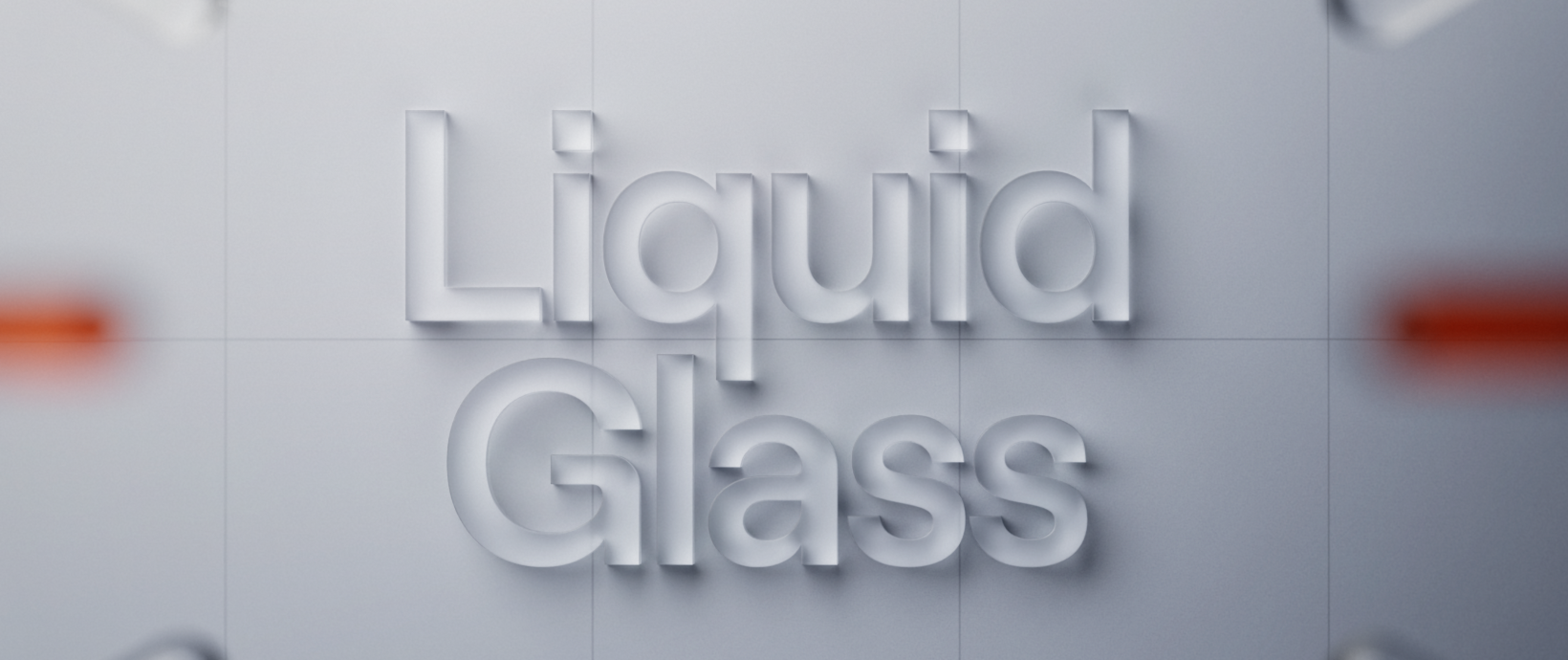
Reduced Motion. Well-chosen animations usually bring an app to life, but they can cause dizziness or nausea for some users. With Reduce Motion turned on, we avoid zooming and sliding transitions, flashing, parallax and animations that start without user interaction. Our recently added Liquid Glass support brought zoom transitions with it. Fortunately, it’s a system feature that responds to Reduce Motion automatically and turns the transition into a cross-fade. Since we use system navigation throughout the app, we only had to track down our custom animations: we disabled the Lottie logo animation shown after installation and adjusted the transitions in Quick News as well as the animated segmented control in the player and search.
→ Native components handle accessibility for you that you don’t even know about.
What’s left
📌 Captions. We only have text synchronized with audio for live radio stations, and it currently doesn’t work for any of them; for other audio we only offer a transcript (the full text). That’s not enough to tick the box, so we still have work to do.
📌 Audio Descriptions. These are mainly intended for video, describing what happens on screen between lines of dialogue. In the context of iROZHLAS, they don’t make sense to address yet.
Why It Was Cheap, and Why That’s No Accident
All of the changes described touched 23 files and added ~220 lines across two pull requests. No refactoring, no rewrite. Audit and manual QA included, done within a week.
It wasn’t chance or luck. It was the result of decisions made at the start of the project:
- Design tokens → fixing contrast meant editing one token, not fifty fixes scattered across screens.
- System navigation wherever it makes sense → we got Reduced Motion largely for free.
- VoiceOver in the acceptance criteria from day zero → we could tick Voice Control without writing a single line of code.
In other words:
Accessibility is a downstream effect of upstream discipline. It only comes cheap where the codebase is healthy, which makes it a good litmus test of the whole product’s maturity. When accessibility is cheap, so is every other change.
Written by Jakub Marek, iOS developer at Futured.







.webp)
%20(2).webp)
.webp)
.webp)
.webp)

.webp)
.webp)
.webp)

.webp)

.webp)
.webp)

.avif)